Color can make a document feel polished, clear, and engaging—or it can distract and confuse readers if not used thoughtfully. When you design professional reports, fact sheets, or infographics, choosing the right color combinations matters!
Here’s a simple infographic to help you make strong choices:
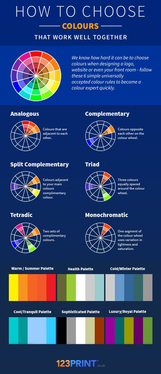
Quick Tips for Professional Color Use
- Follow the brand: If the organization has a branding guide, use it.
- Stick to 2–3 main colors: Too many colors can make your work look messy.
- Ensure strong contrast: Make sure your text stands out clearly from the background.
- Think about tone: Bright neon colors might work for a concert flyer, but not for a business report.
- Use color to organize: Consistent color coding can guide the reader through your document.
Thoughtful color choices help your writing look polished, intentional, and easy to read.